Pre-Order Poll: Choose the version for our next project : Borealis Scorpionfish
- Thread starter Borealis Watch Admin
- Start date
bobbysamd
Master Apprentice WIS
Yes. The minutes hand outlined in orange, a la Plo Prof. White-on-black date complication; all something like a Jacques Etoile Atlantis, which I have.Not late whatsoever as design is not closed and opinion of all is very important!
You mean changes to this render, right?


frenco
WIS
As I said, the orange minute hand is great, not just because it makes a lot of sense in a diver, but also because it will be perfect with an orange isofrane, bonetto or cuda.
Actually, the HEV is totally useless for 99% of the buyers.
Drilled lugs would be welcome, for safety.
Maybe you can skip, as suggested, the bracelet and offer two Bonetto 317, one black one orange, the 317 is 24mm only at the lugs, and 22 elsewhere.
Actually, the HEV is totally useless for 99% of the buyers.
Drilled lugs would be welcome, for safety.
Maybe you can skip, as suggested, the bracelet and offer two Bonetto 317, one black one orange, the 317 is 24mm only at the lugs, and 22 elsewhere.
For us to go through with this project we have to use a bracelet as this is also a way to help factory otherwise they won't let us use the cases and will offer them to someone else.
We have not received yet quotation from factory as specs are not finalised. However you can be assured our offer will be one of the most affordable offers in market for a watch with this specs.
ZASKAR36
WIS
You guys are on a roll!
I'm easy to please. I like the original design with the ploprof hands and the updated one with the new hands equally. I think my preference for the handset would be swayed after seeing side views of the case. IMO, the shape of the case usually lends itself to specific shapes so seeing the side views will most likely sway my preference. Right now though just from a dial perspective both look great to me.
I'm easy to please. I like the original design with the ploprof hands and the updated one with the new hands equally. I think my preference for the handset would be swayed after seeing side views of the case. IMO, the shape of the case usually lends itself to specific shapes so seeing the side views will most likely sway my preference. Right now though just from a dial perspective both look great to me.
- I could do an orange min outlined hand, moresoe with the ploprof handset though.
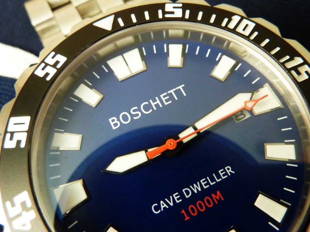
- With that said, the orange second hand doesn't bother me. I get that the orange min hand is more traditional, but my Cave Dweller II has an orange second hand and its awesome. I don't dive at all, but does a orange min hand really make it much easier to read the time while under water? I don't know.
- White on black date wheel.
- I like the ceramic bezel. I do have a sapphire bezel in my collection and I really don't prefer one material over the other. Both are nice. The fact that this ceramic bezel will be lumed is GREAT!
- Love the font you've chosen on the bezel itself.
- Only other comment that I have is to print the 2000m/6500ft text in the same orange color as the orange second hand/orange min hand (depending on which way you decide to go). It's a nice detail that brings everything together. I love that little detail in my Cave Dweller.

ZASKAR36
WIS
I don't get this. Add the Breitling logo, a gmt complication, more text on the dial, double the min markers on the chapter ring, more fancy chrome bordered hour markers, chrome bordered date window and the watch goes from ugly to beautiful?a quick photoshop mockup to show what I mean.

Bunitu bunitu! With this you have a winner
Seems like the original designs are cleaner and easier to read, not to mention a GMT complication would add to the cost.
Lastly, I think that dial works on the Brietling because the Briet uses a SS bezel, not a black ceramic bezel. The SS doesn't force the eye inward allowing the dial itself to "breath". The avenger dial just doesn't work IMO with the black ceramic bezel of the Borealis concept as everything feels more crowded.
I tend to like the 2 original designs better.
Last edited:
ZASKAR36
WIS
I like the original designs better. The curved hour markers seem to clash with the rest of the hour markers on the dial that are all squared / hard edged.Just a quick mockup. Not sure if it works this type of markers coupled with the rectangular ones.

Your thoughts?
karmatoburn
Perfect Apprentice WIS
Promising design and lots of good comments going on. If be interested in seeing a 3/4 or side view of the case to get a better idea of the shape.
As for the dial I would love it if the chapter ring went all the way up to the crystal to give a sense of depth to the dial and because I'm not a fan of a deep dish silver rehaut. It would also be cool if the chapter ring were cut out around the markers like on the Pelagos as it gives a cool 3D effect.
The fin/tooth markers of the Megalodon are bloody awesome but I don't think they go well with this case/bezel design.
Finally, a non-diver (Zenith/IWC big pilot style or field) watch would be cool for your next release.
Millbarge
WIS
i think you are right, my thought was that it might be nice to somehow incorporate some kind of design element that spoke to the name "Sunfish"I like the original designs better. The curved hour markers seem to clash with the rest of the hour markers on the dial that are all squared / hard edged.
Is that name final now BTW?
I kinda think if you keep the design basically as is being discussed that something else might be more appropriate...
I like SeaDevil or maybe SeaRaven...
save SunFish for some later diver that you cram so full of tritium that it's like looking at the surface of the Sun.
So which name you suggest starting with S ?
We have so far
We have so far
- Sunfish
- Sea Devil
- Sea Raven
- Sea Snail
- ...
TheWraith
Master WIS
That watch above, the Sunfish, as it looks above, I would buy in a heartbeat. The original Starfish design I don't think I would.Sunfish is actually a nice name! I like it! The case back will be Borealis Mermaid as we have been using in our Diver Watch lines.
Quick mockup of the Borealis Sunfish with some of the requested changes (dial with triangle marker and circle markers)


sbmutz
Master Apprentice WIS
Really like the original design, with a few comments/questions:
1. Orange minute hand as suggested by others is a great idea
2. A 24/22 mm bracelet taper would be my preference.
3. Love the original "sword hand" style for hour/minute hands.
4. Will the crystal be sapphire?
5. Exhibition case back? In sapphire?
6. Crown guard would be a nice feature.
1. Orange minute hand as suggested by others is a great idea
2. A 24/22 mm bracelet taper would be my preference.
3. Love the original "sword hand" style for hour/minute hands.
4. Will the crystal be sapphire?
5. Exhibition case back? In sapphire?
6. Crown guard would be a nice feature.
Jamania
Patriarch WIS
Do agree... Just need to add a litle mermaid logo and I will preorder ! And the dot at 12 ! Very important the dot at 12 on the bezel ! Thanks for your concern. Et bonne nuit.Just to confirm...this design is good, but I don't think I would buy it:
View attachment 238
But I would buy this design without hesitation:
View attachment 239
Steve Davies
Master Apprentice WIS
In all honesty, without even so much as a caseback design, the name barely matters.So which name you suggest starting with S ?
We have so far
- Sunfish
- Sea Devil
- Sea Raven
- Sea Snail
- ...
if you stick with sunfish and want something to better represent that, what about a full lumed dial? Not for everyone I'm sure, but if you're only producing 100, at the right price I'm sure you'll have no problem selling them
Millbarge
WIS
i really like full lumed dials and it would fit the name better.In all honesty, without even so much as a caseback design, the name barely matters.
if you stick with sunfish and want something to better represent that, what about a full lumed dial? Not for everyone I'm sure, but if you're only producing 100, at the right price I'm sure you'll have no problem selling them